| Nottinghamshire County Council - Notts Outdoors
A few years ago, the Outdoor & Environmental Education service maintained a small online presence under Nottinghamshire County Councils website.
Their text heavy pages were being visited infrequently, also their content and positioning were confusing as it remained unclear who the pages were aimed at. I was involved in a redesign and rebrand of their identity, their content and the services they provided to end users.
Looking at the existing pages, the goal was to provide a new identity and website called NottsOutdoors for a targeted audience , promoting the service and the offers available.
The service provides outdoor learning opportunities for young people in Nottinghamshire by working with schools, colleges, youth groups and employers to enhance the lives of young people.
Text heavy | dull layout with minimal visual impact
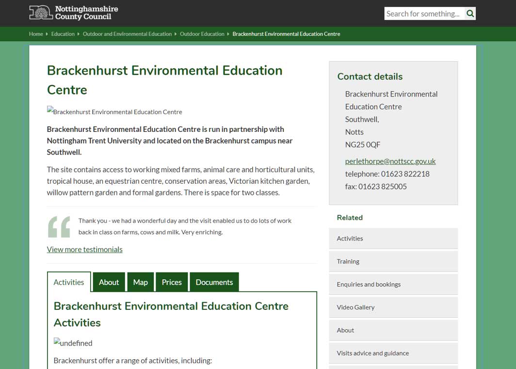
Centre pages | contains useful tabbed information
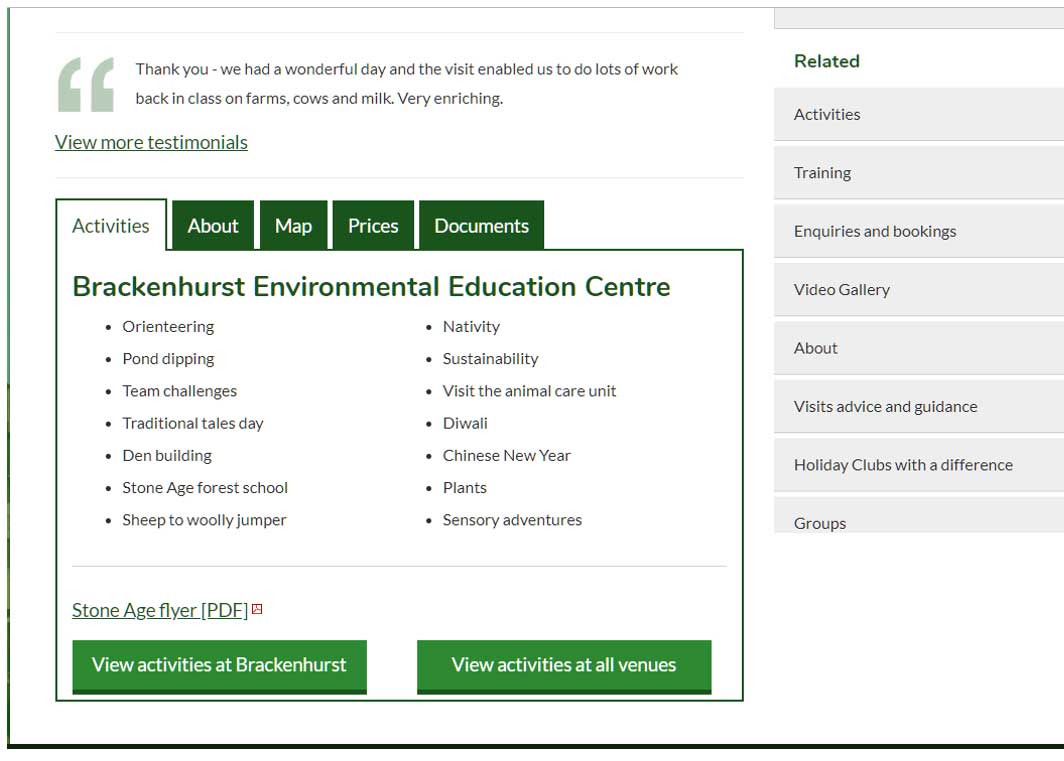
Text heavy | information about centres but no images
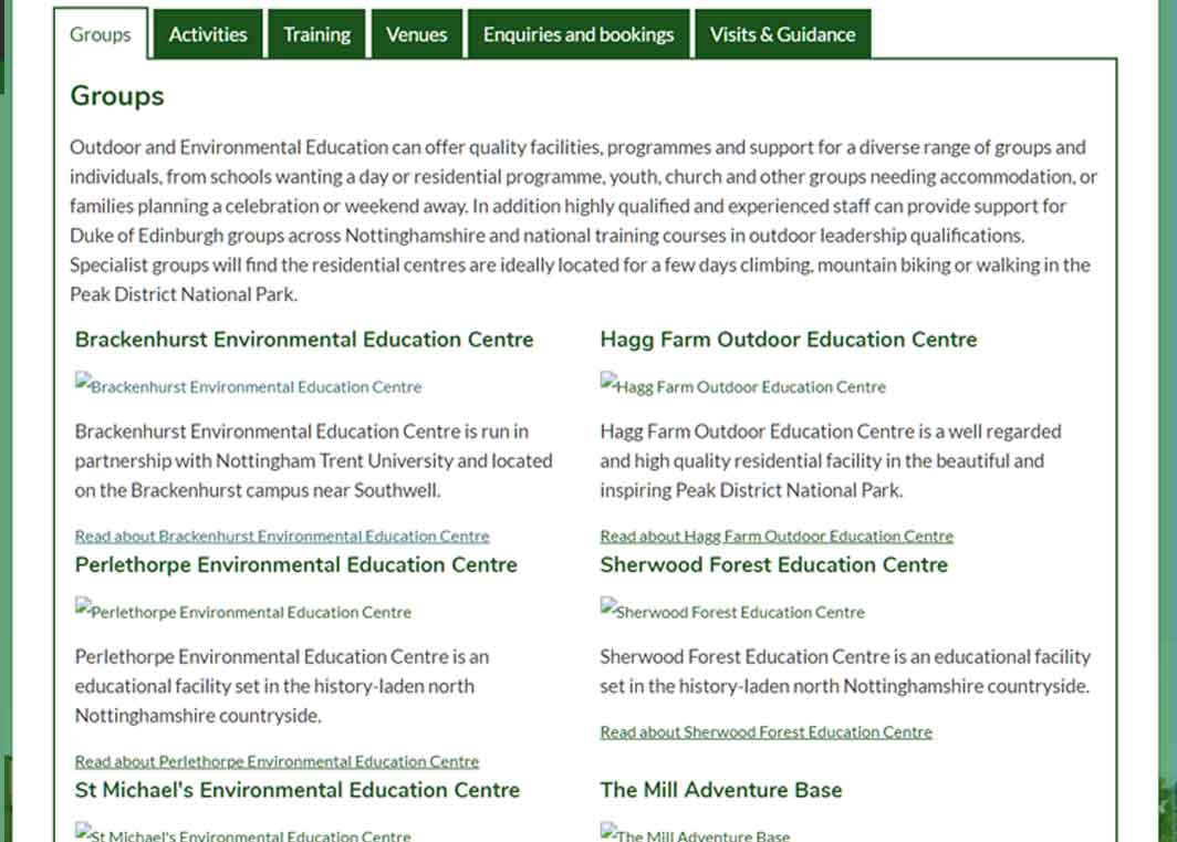
Centre pages | broken down in tabs but very text heavy
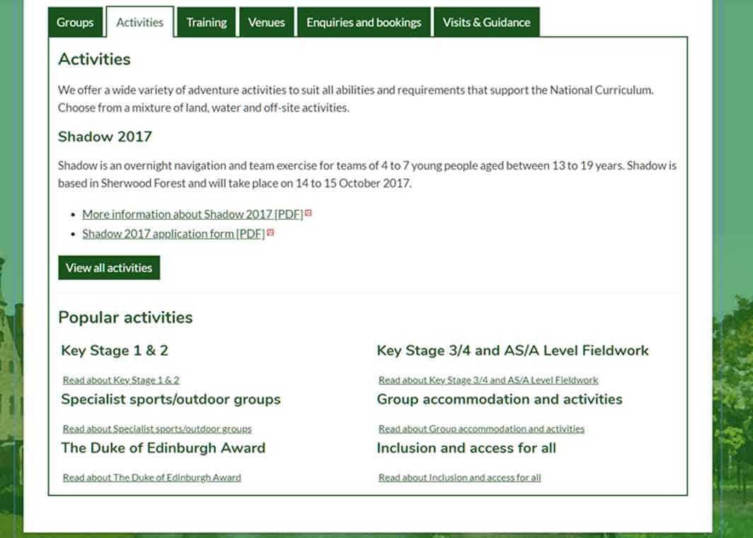
It was clear a rebrand of their identity was required . The existing site consisted of large sections of text heavy pages within the Council website, difficult to find or promote.
The service needed to better promote their offering to the public through a more visually responsive website, showcasing the host of activities available and the possibility to book trips targeted at their users.
Discussions with stakeholders and potential users took place to identify key factors:
Luckily there already was an existing user base for the site.
They were clearly identified as people looking at activities with the intention to book day trips or longer trips. Primarily we were looking at teachers in schools who already use the existing site to book activities for their classes. Other users consisted of parents who would have the ability to book activity days out as a family.
After speaking with potential users and shareholders as a team, analysing research gathered and looking at content, I was responsible for designing a new, visually impactful website.
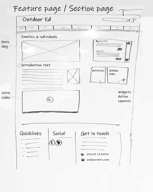
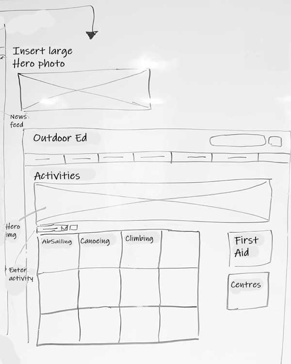
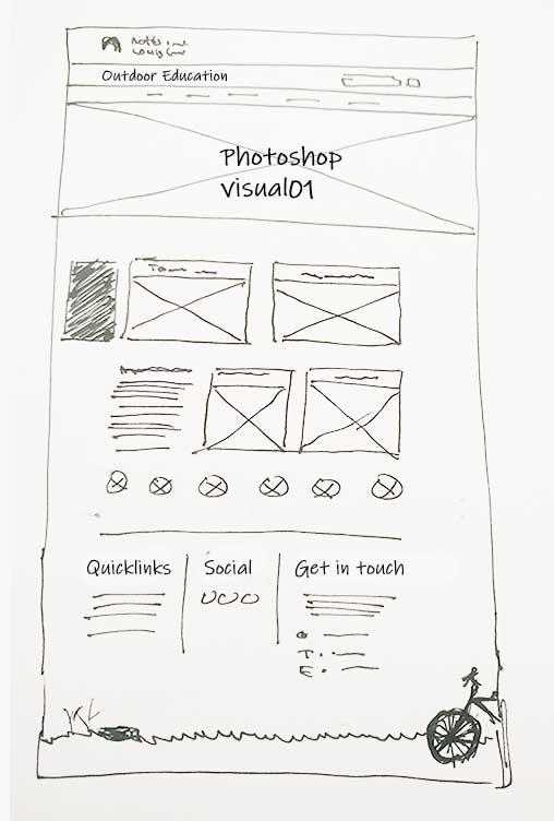
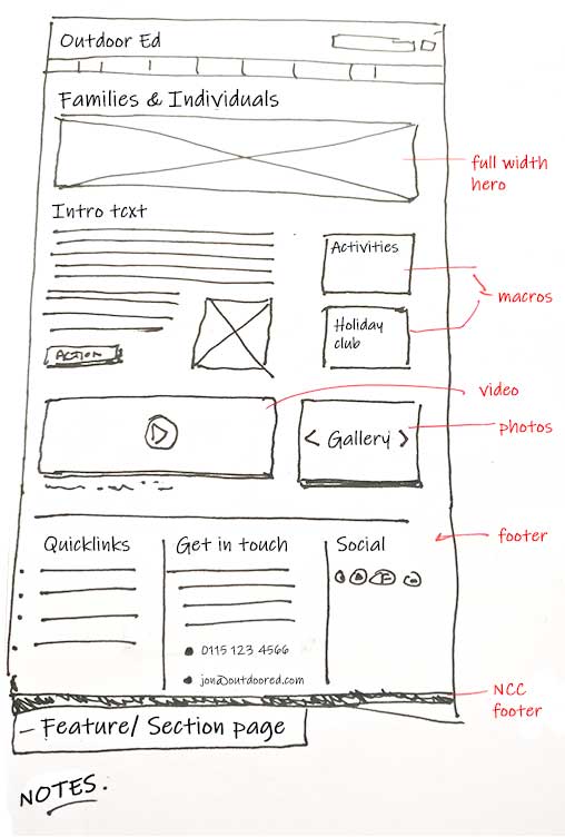
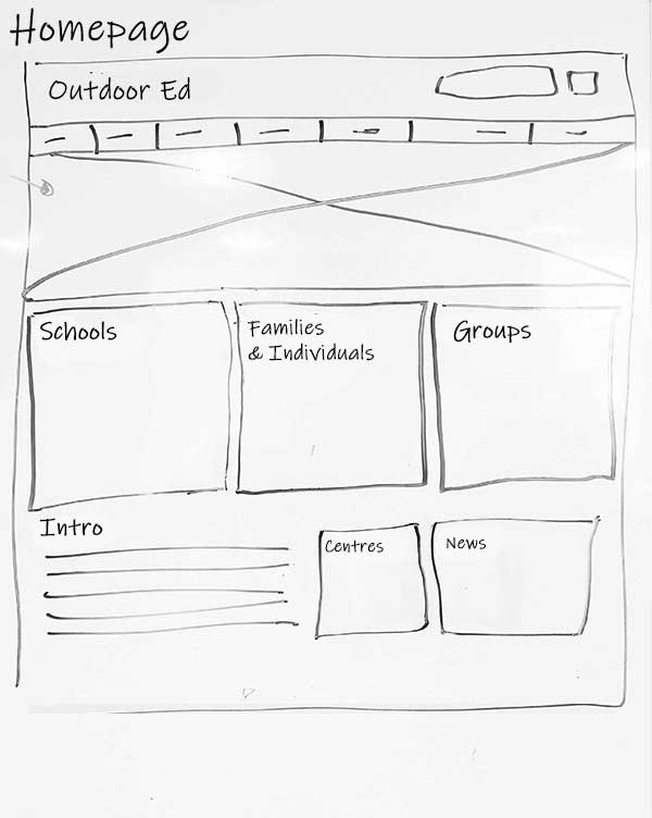
This took on the form of multiple discussions with the service, initial wireframes and presenting design routes. After discussions with teachers and parents, we determined different user flows and possible user journies that could be taken.
Using Adobe Illustrator/ XD, multiple wireframes illustrating user flow were designed, alongside Adobe Photoshop visuals and HTML responsive web build.
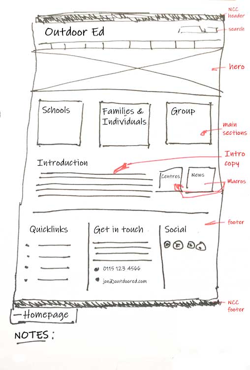
01 | Homepage V1
02 | Feature page
03 | Activities page
01 | Homepage V2
02 | Feature page V2
03 | Homepage V3
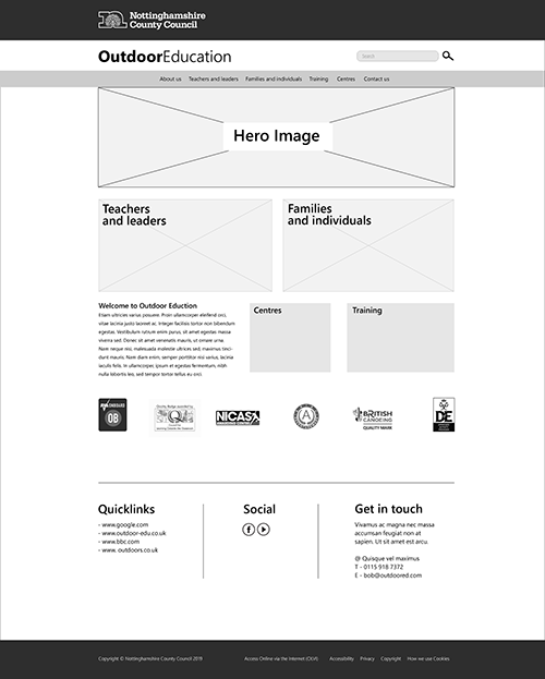
01 | Homepage
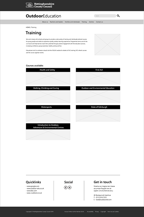
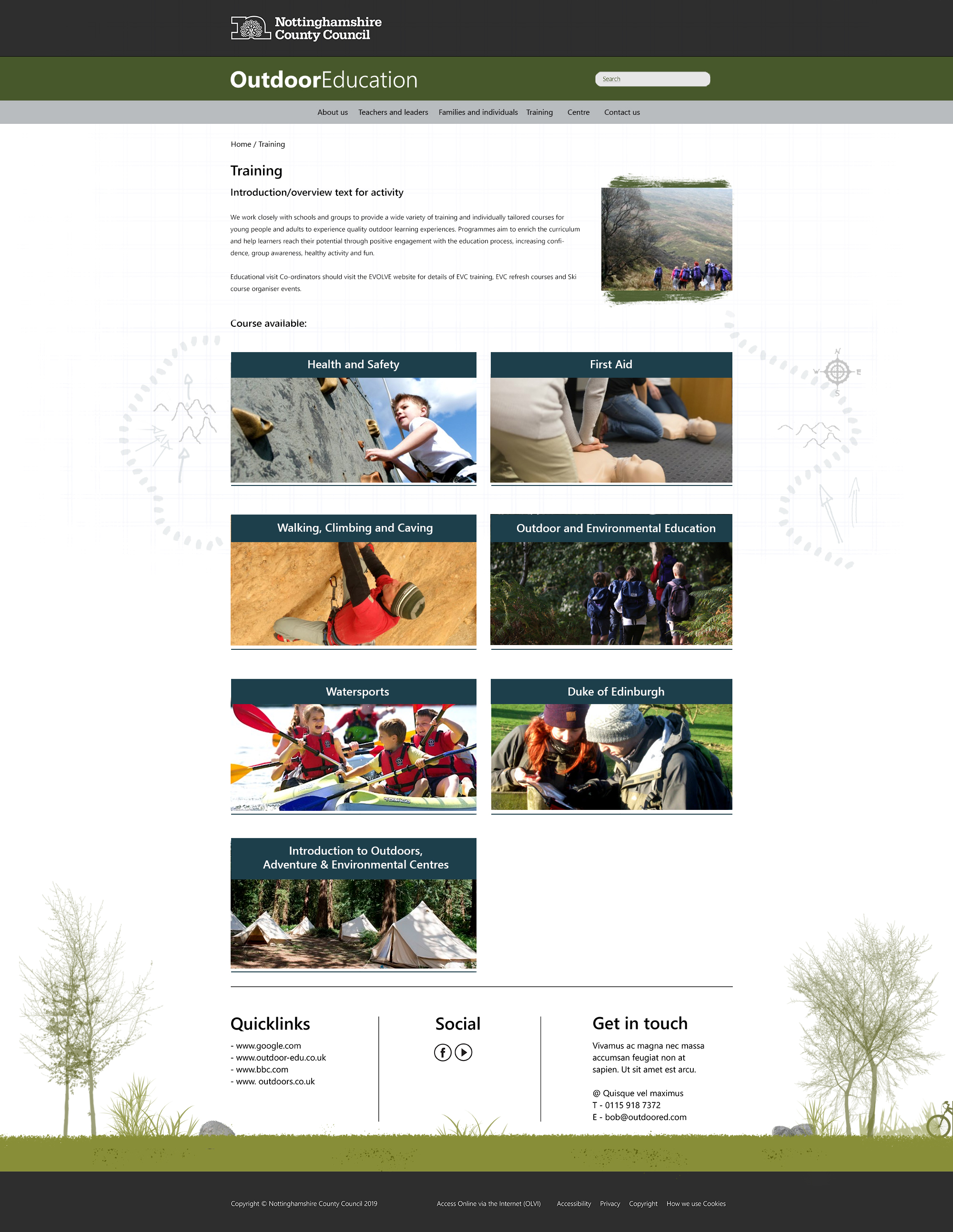
02 | Training homepage of courses to pick
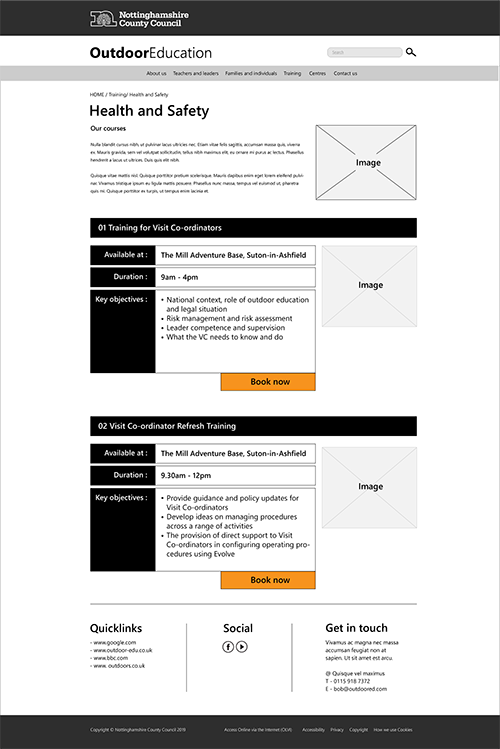
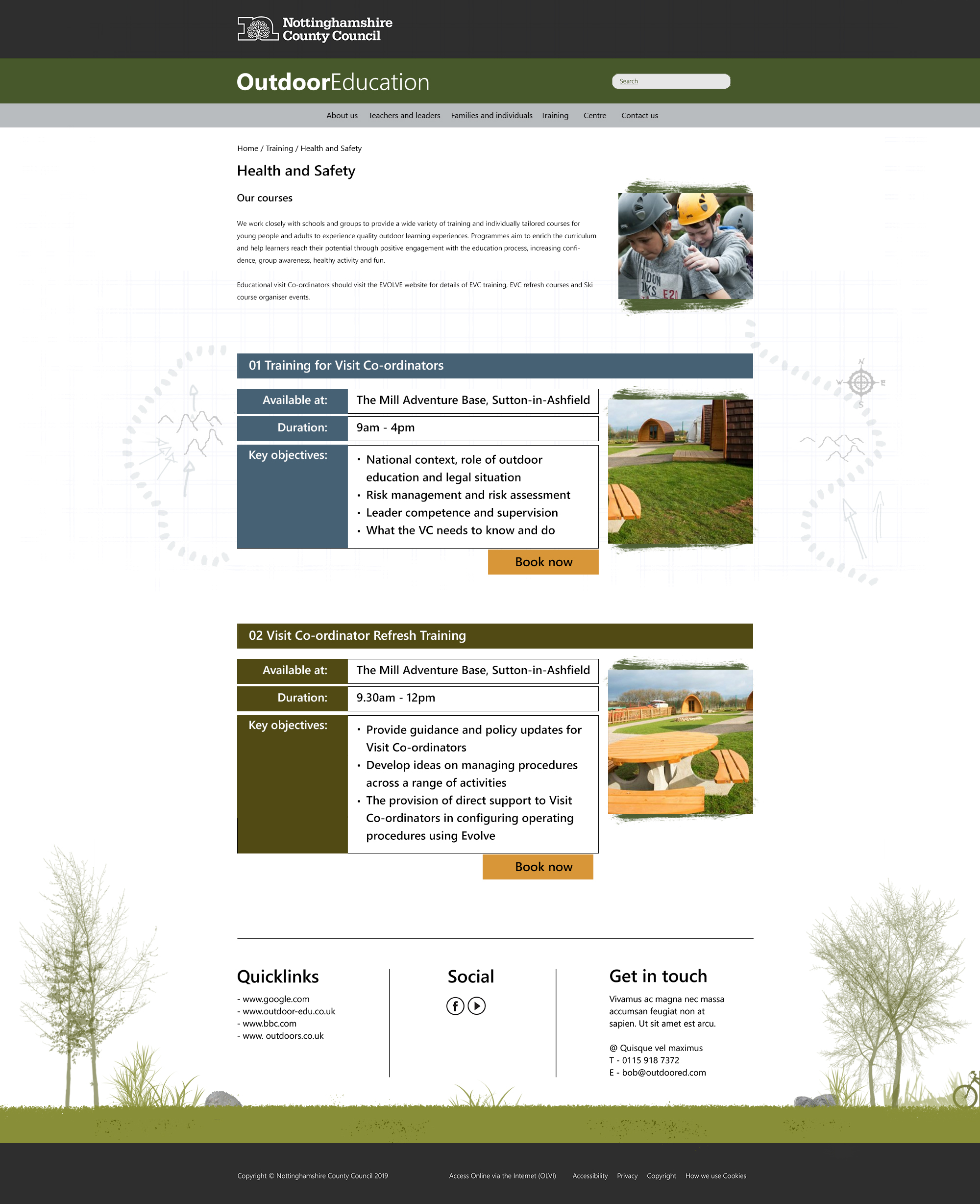
03 | Training courses for users to choose
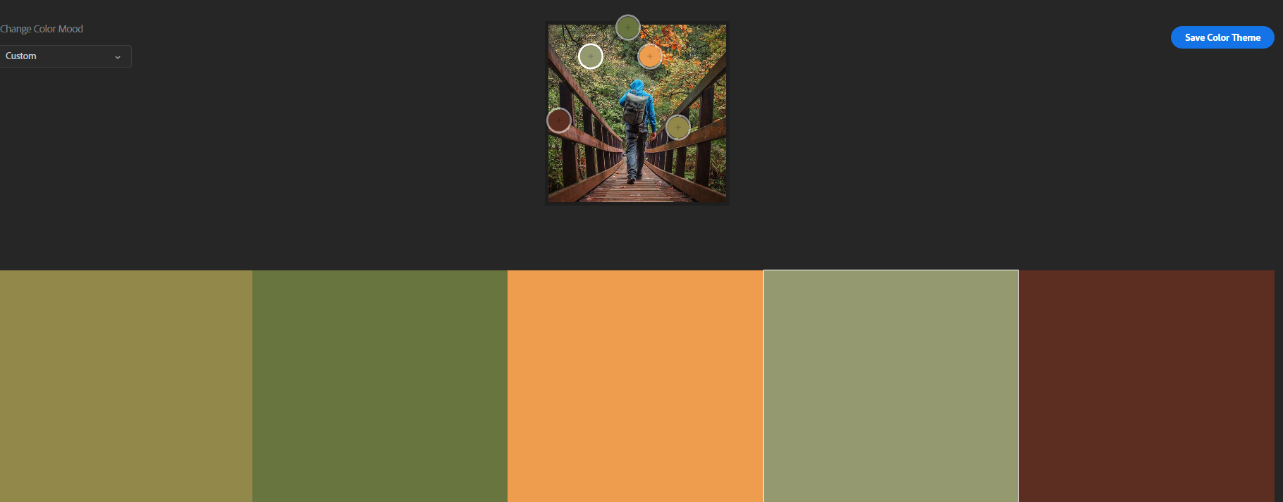
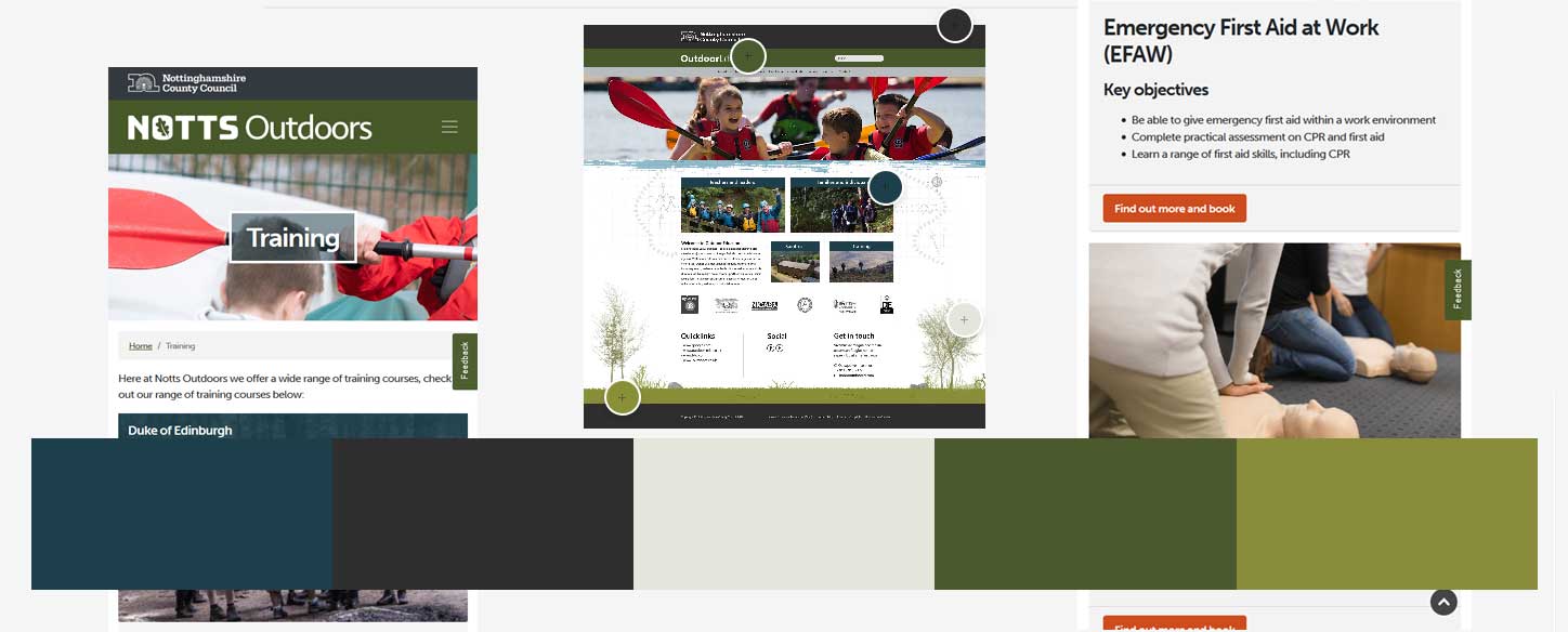
Testing colour schemes | Earthy colours
Testing colour schemes | Responsive layouts
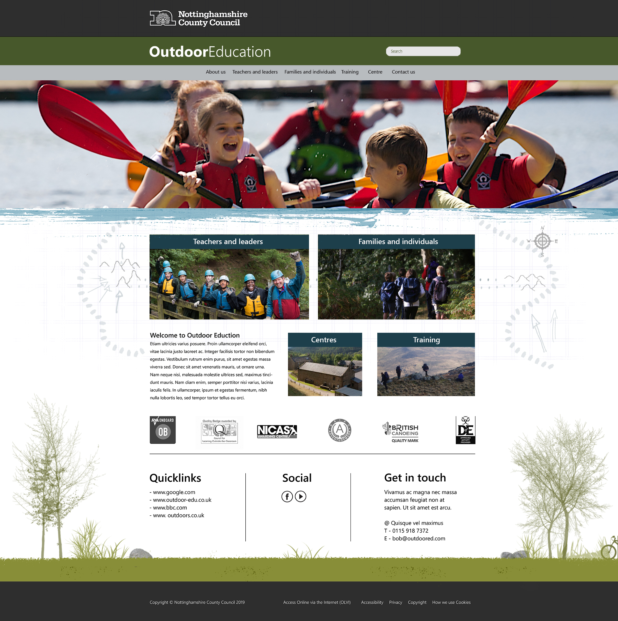
01 | Homepage
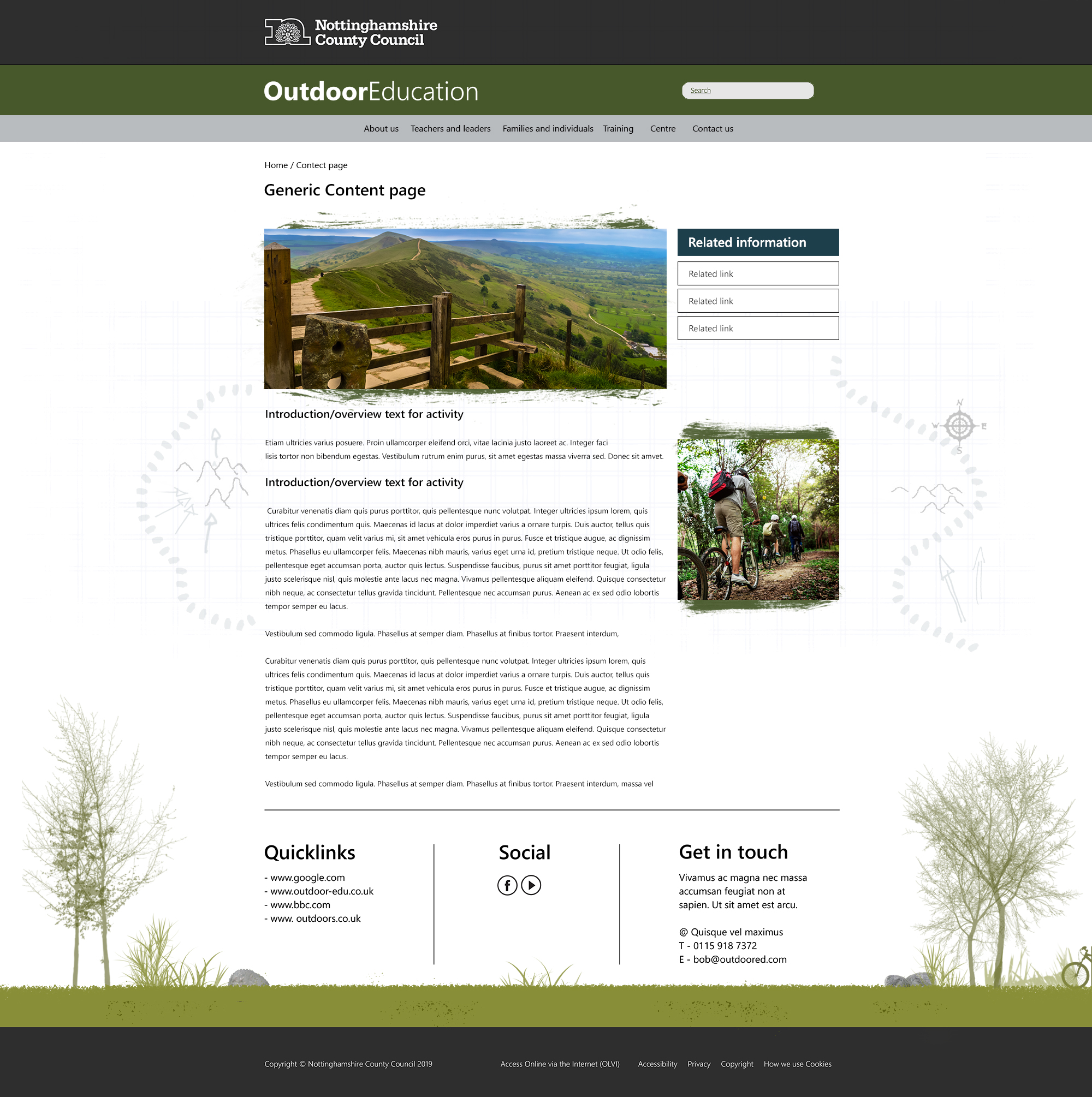
02 | Generic content
03 | Training homepage of courses to pick
04 | Training courses for users to choose
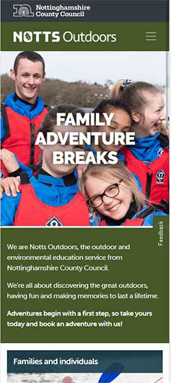
Responsive | Adventure breaks layout
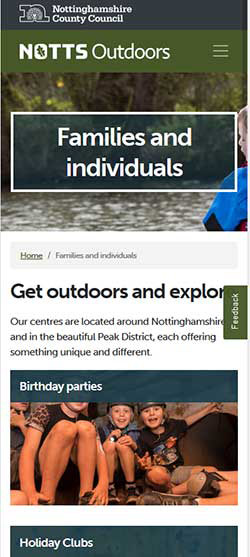
Responsive | Families and Individuals layout
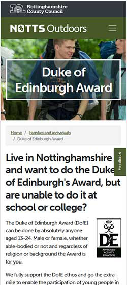
Responsive | DOE layout
I unfortunately had left the business before the launch of the new design and my involvement on the project had come to an end. Fortunately, the ongoing team continued to fine tune/ iterate parts of the design and user flow. There were also ongoing functional/ aesthetic amends to be made to a new booking system handled by a third party.
Although I was not part of this process, I was proud of the UX and design work I put in place and it is great to see a working end product that is live and surpasses the old design in terms of usability and functionality.
Ξ Work