| Nottinghamshire County Council - Travelchoice
In 2018, the Transport Planning and Development Programme at Nottinghamshire County Council were looking to have a new website built aimed for people around the Nottinghamshire area providing information to undertake travel planning in Mansfield, Newark, West Bridgford and Daybrook using public transport.
With this project, Travel Choice's many aims were:
Jobseekers | working with Job Centre Plus in Mansfield and Newark to help people get to and from their new jobs.
School leavers | advising students who wish to walk, cycle, car share or use public transport across Nottinghamshire.
Residents | door to door knocking offering residents personalised travel planning advice.
Employers | offering workplaces free packages to help encourage staff and visitors to reduce single occupancy car use by promoting car sharing, cycling, walking, public transport and ultra-low emission vehicle use.
Travel Choice sent out teams of travel advisers to go door to door to assist local residents with their travel needs, providing advice, information and incentives to people. Much of the information and data collected advised the variety of content that could be accessed through the site.
I was responsible for the design and build of the new website alongside developers.
This involved initial wireframes, doing iterations of designs, having discussions with managers and the service and finally presenting multiple design routes. We suggested the most optimal user flows and journies that could be taken, based on discussions that took place.
Using Adobe Illustrator/ XD I designed multiple responsive wireframes based on sketches to illustrate user flow alongside Adobe Photoshop visuals and HTML responsive web build.
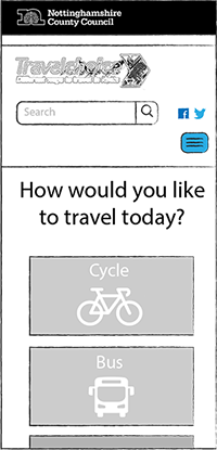
01 | Homepage
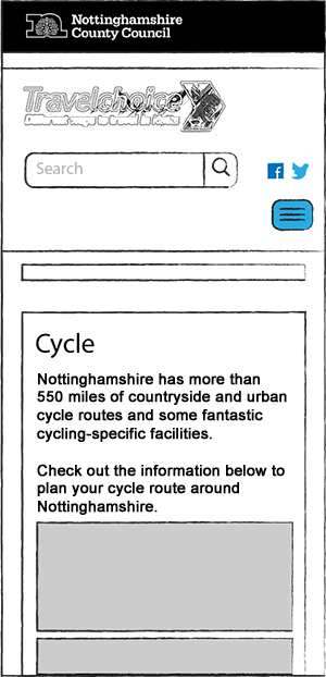
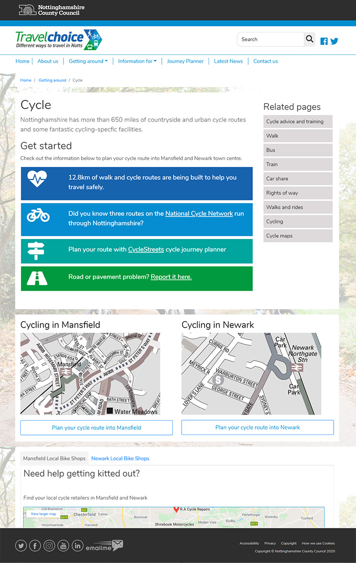
02 | Cycle page
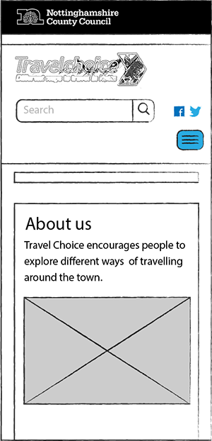
03 | About us page
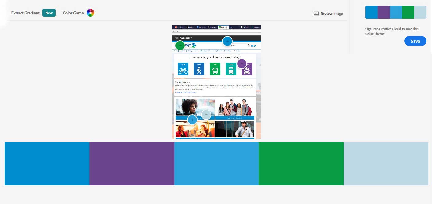
Colour schemes | Specific colours utilising logo palette
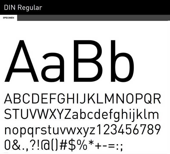
Typeface | Din was deemed the most appropiate sans-serif typeface to use across the site. It was crisp, clean and tested well with the client and users.
Logo | The colour scheme used through the site echoed the colours within the logo, helping to maintain an engaging, strong and consistent brand.
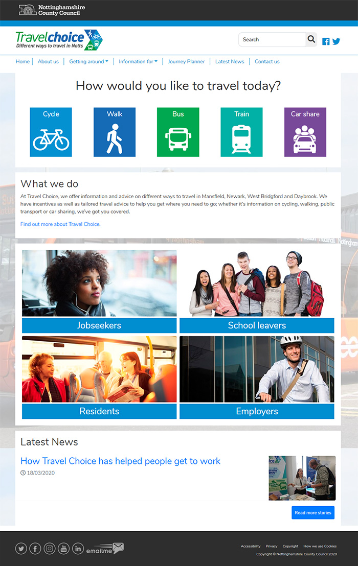
01 | Homepage
02 | Modes of transport - Cycle
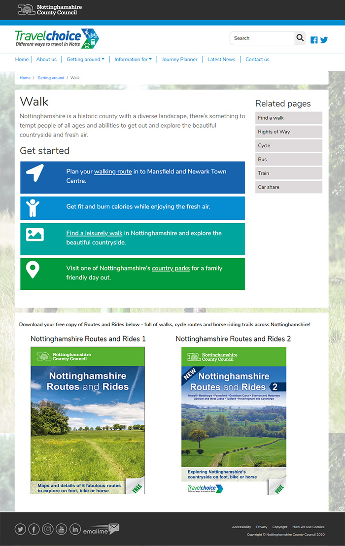
03 | Modes of transport - Walk
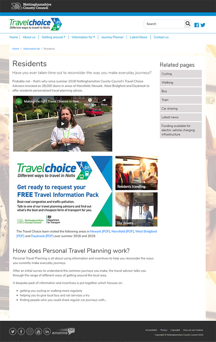
04 | Residents information
Once the site was launched, it was relatively successful with pages being popular in terms of usability and visited frequently. I enjoyed the creative work carried out regarding the UX and design, alongside the collaborative team work amongst managers and the client themselves.
Ξ Work