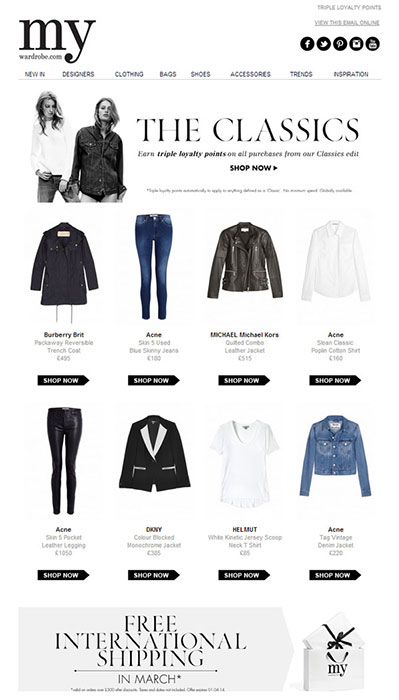
| MyWardrobe

Email campaign design and build

Introduction

MyWardrobe was an online, womenswear fashion retailer who sell contemporary and luxury womenswear fashion and accessories to a worldwide, loyal, consumer market. They ran continuous promotions and held secret Pop up shops and events around London.

The main method of advertising promotions and the pop up events was through their website and capitalising on their hugh consumer market, by creating targeted email campaigns worldwide.

About the project

The project consisted of designing and building visually impactful email designs. I built and created successful email campaigns through targeted segmentation of MyWardrobe customers from a growing global database, advertising the latest promotions and offers on product items available through the MyWardrobe website.

Email design

Hero | Free shipping visually impactful emails
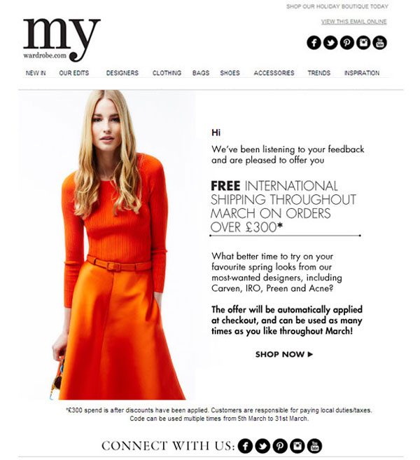
Free shipping visually impactful emails

Hero | Clean and striking layout emails
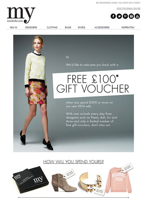
Free voucher offers through visually impactful emails

Hero | Visually striking Boutique emails
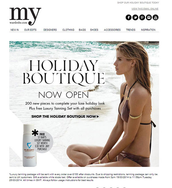
Holiday Boutique visual email

Users and audience

| The user base were all online with the exception of customers visiting pop up shops in the UK. Insight, targeting, segmentation and product choice played a big part in identifying what would sell

I came onboard with MyWardobe at a time when they had a huge, worldwide customer user base. There was already a variety of emails being sent daily. Email campaigns were targetted and tailored to suit the variety of users.

We had daily, popular Merchandising emails highlighting specific styles of clothing, colours and seasons. Alongside these campaigns, there were more visually impactful emails highlighting specific clothing and the hottest trends.

My role

As mentioned, the majority of promotion and advertisement for the business came from producing successful targeted email campaigns. I was brought in to help design, build and run these campaigns through the existing CRM campaign software.

This involved working alongside other designers, marketeeers, developers and managers, using research and gathering insight to best predict patterns of how and what our users were interested in purchasing. This took on the form of discussions amongst sales teams and managers, wireframing and sketching out possible solutions for future emails.

Using Adobe Photoshop and Illustrator, I designed multiple layouts. Alongside the look of the emails, I worked with another colleague to look at the analytics and record the success of each campaign taking into consideration success rates of emails being opened leading to purchases taking place through CTA to the website.

Wireframes | designs

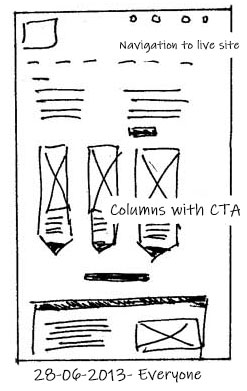
01 | Wireframe tests with columns

All emails begand with sketching the most usable, visually appealing layout

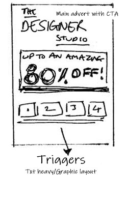
02 | CTA image led tests (Call to Action)

Looking at the most effective CTA across different layouts

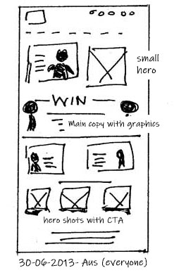
03 | Visual led/ magazine layout

A magazine style layout with multiple hero shots and CTAs involved

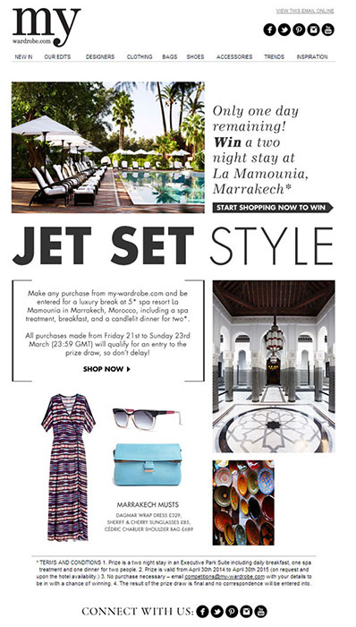
01 | Standard Feature email layouts

Magazine layout built in HTML for an email campaign

02 | Standard Merchandising email layouts

Standard menchandising layout emails were very popular and successful

Launch | Impact

The email campaigns were a daily task. Once one was running, the attention shifted to the next campaign running in time with seasonal trends and fashion highlights across the world. The majority of campaigns sent out were worldwide and proved very successful with fantastic promotions and offers being advertised through the emails.

There were many occasions where our campaigns were more UK based, targeting specific users and allowing segmentation to occur within the different tiers of loyalty based on past spending. This was also ran worldwide too where certain products would be swapped out to initialise simple AB testing to observe which products were selling better. The sheer volume of customers (around a quarter of a million) allowed us to tailer and sharpen the campaigns further.

Ξ Work