| Boots

Boots website

Visit Boots

Introduction

Boots have an ever growing and thriving website packed full of valuable information for users ranging from health and pharmacy, beauty and skincare, baby and child to electricals to name a few. I worked alongside a multitude of talented people at the Boots head offices in Nottingham working on creating fresh content and making user friendly pages for the site.

About the project

Working in the digital team, my tasks required on-going work on the main website, reviewing existing older pages whilst creating and maintaining new content with the aim of keeping the site fresh and current.

Using the in-house CMS, and working alongside project managers and copywriters, a variety of web pages/ sections were designed and built for the different sectors of the Boots website including Beauty, Pharmacy & Health, Mother & Baby, Parenting Club and Advantage Card.

Design & build

Spring | working alongside the in-house design team to help create the new Spring Campaign
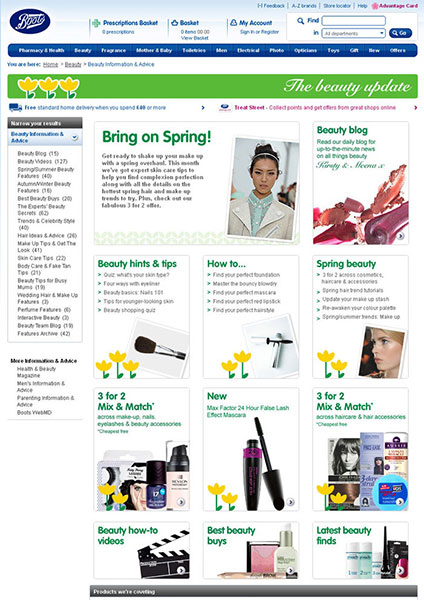
The Spring campaign built along the design team at Boots

WebMD | A clean, visual look was designed and implemented into the CMS
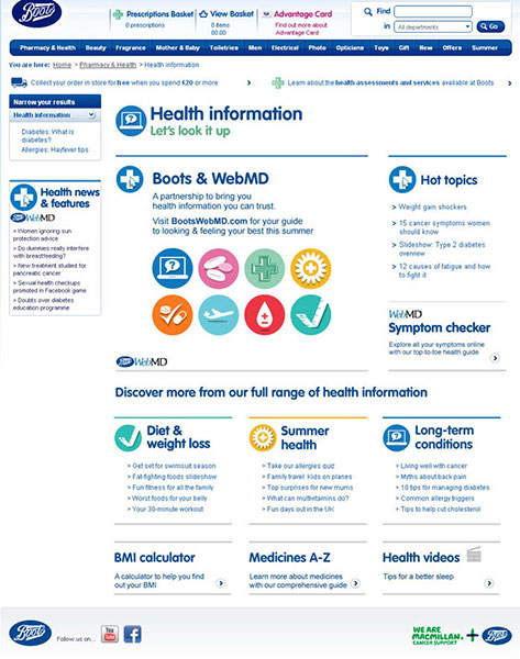
WebMD also built alongside the design team with many assets designed and built in HTML

Advantage card | The aesthetic look and functionality had a big redesign
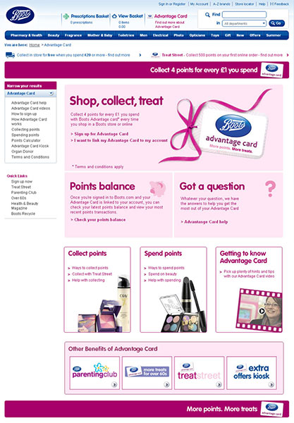
Advantage Card received a hugh redesign with the aim of improving usability

Users and audience

| Due to the variety of products being sold online, Boots cater for a huge target audience covering a range of different users.

The users are vast with an audience of all ages and backgrounds with different requirements when they visit the site with the intention to purchase. When designing for Parenting club, the users are new mothers and fathers, when covering Frangrance pages, the users are a mix of young and old and mostly women.

When you look at what it is Boots can provide through their website, the product line is huge so of course, so is the user variation. This audience can be reached not only just online, but also via TV and print.

My role

My work always began with who our users were regarding the product we were looking to advertise and sell online. This sparks other avenues of creativity helping us to achieve agreed goals and objectives. Using Adobe suite whilst always maintaining the focus on usability, we provided end users with satisfying experiences.

During discussions with other designers, developers and managers I worked using the CMS, designing and building pages & assets for the main homepage and other sections of the site. Assets built ranged from new imagery for the main hero panel through to secondary side panels for different sections ranging from Parenting club, Beauty, Spring campaigns and Mini club. The creation of new pages presented content in an easier, clearer way to digest for the end user.

Wireframes | designs

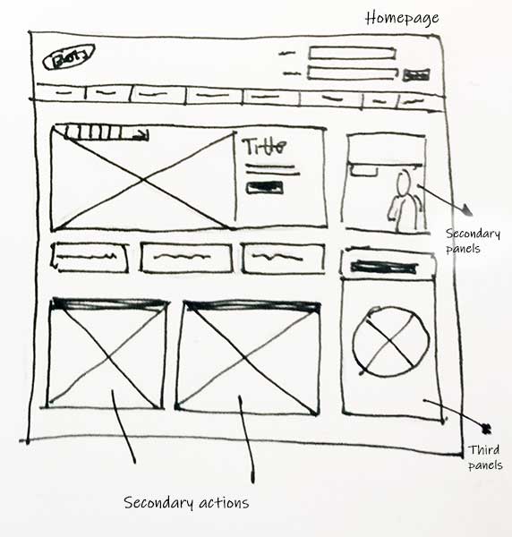
01 | The homepage was consistently reviewed to keep content fresh.

The Boots homepage was always changing to match current promotions, ongoing sketchwork and design was required

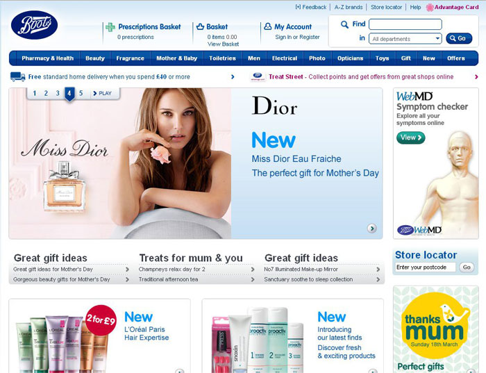
02 | Beauty products proved very popular so usually captured the much sought after homepage spot with a carousel showcasing multiple products and promotions.

Homepage with it's current promotions

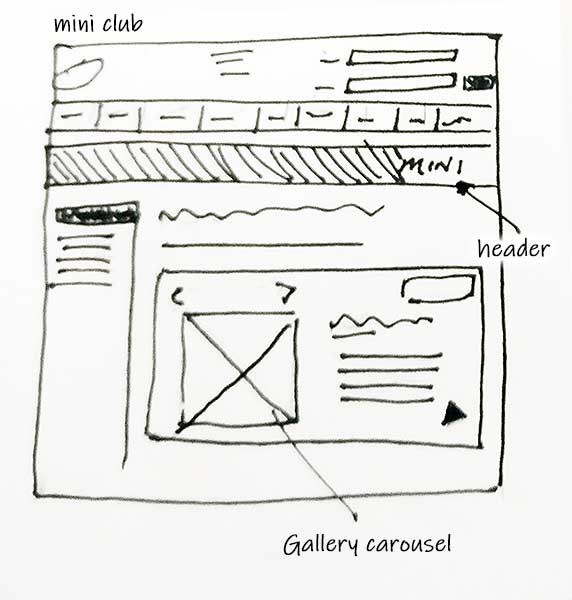
03 | Mini club was almost a site within a site with its content and imagery.

Mini club undertook a major change in design and usability. Lots of inital sketchwork took place

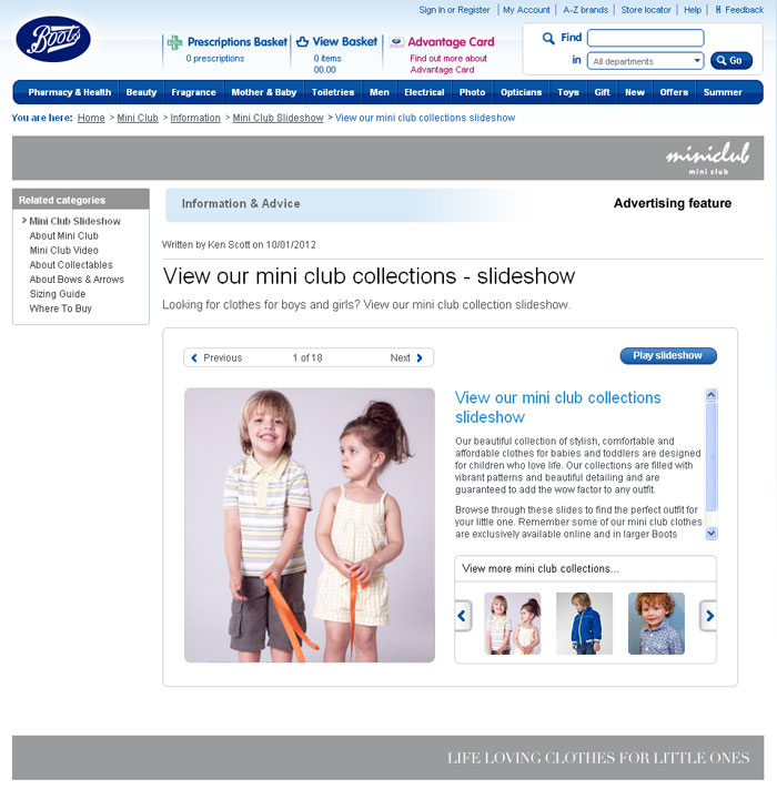
04 | It also proved very popular with users through fantastic photography and simple carousels showcasing items.

Final design of Mini club

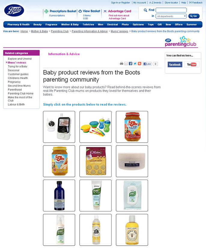
05 | Product reviews page were redesigned.

Final design and HTML build of Parenting community

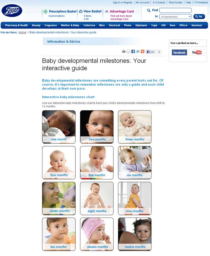
06 | Milestones page also used a similar layout,

Final design and HTML build of Milestones page

Launch | Impact

The work at Boots was interesting to me as they had many existing content pages that oddly all seemed to stick to the same format regarding layout and design.

The new pages and sections that were designed did something different with the design and were more user focussed, also proving popular when looking at the site analytics for those sections. Page visits were more frequent, time spent on pages were longer but also led to direct purchases, highlighting the user journey was working. It was clear users felt better well informed about a product and the decision to purchase was clear.

Ξ Work